
From Ambience to Sales: How the Right Light Colour Works in Your Store
Retail lighting and light colour: how to steer atmosphere, product perception and sales with the right Kelvin and CRI
In retail, everything revolves around experience and trust. Within a few seconds, customers need to feel: this is a pleasant store, everything feels right here. Light acts as a silent salesperson. Not just because it makes everything visible, but mainly because it influences how products look, how fresh or premium a store feels, and how long people tend to stay.
Still, light colour is often underestimated. We regularly see stores with good fixtures, but a light colour that just doesn't quite work. A clothing rack that looks flat, bread that appears less warm than it actually is, fish that doesn't look fresh, or a high-end store that unintentionally feels cold. The good news is: this can be solved effectively, as long as decisions are based on function and product rather than habit.
In this blog, we explain how to use light colour (Kelvin) effectively in retail, how CRI (colour rendering) affects your product presentation, and how a simple structure of general and accent lighting can strengthen your store.
Light colour in brief: what does Kelvin mean?
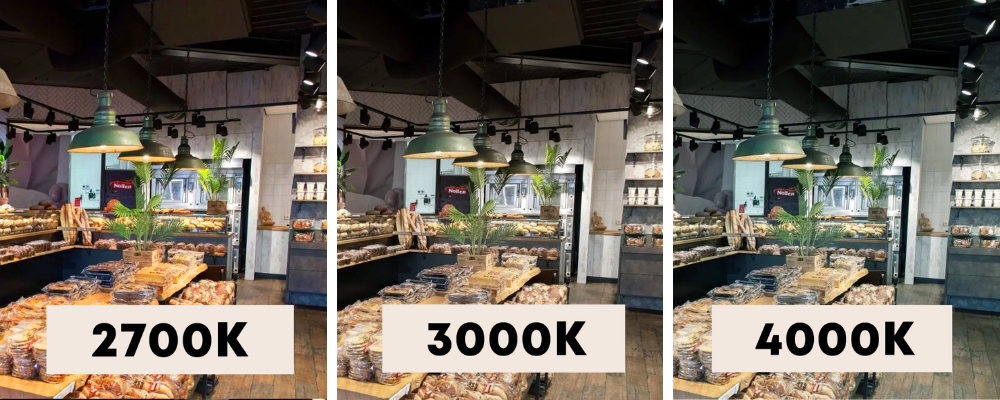
The colour temperature of light is expressed in Kelvin (K). In simple terms, it describes the tone of white light. The lower the Kelvin value, the warmer and more atmospheric the light. The higher the value, the cooler and more functional the appearance.
- 2700K is warm and atmospheric (cosy, inviting).
- 3000K is warm white and often the best all-round choice for stores.
- 4000K is more neutral and fresher (clear, modern and functional).
- 5000K and above moves towards daylight and is mainly used for specific applications.
It is important to know that LED lighting is not automatically cold or harsh. This used to be more common because there were fewer options available. Today, LED can create very warm and comfortable light, or clean and fresh light, depending on what suits your store best.
Why the right light colour directly affects shopping behaviour
Retail lighting is more than just sufficient brightness. With the right lighting setup, you can influence atmosphere, focus and product perception. This affects how long people stay, what they notice first, and how confident they feel about their purchase.
In practice, you can see that colour temperature and colour rendering (CRI) together determine whether a store feels professional and appealing. That is why we always look at lighting from a strategic perspective: what experience do you want to create, and which products should stand out more?
Starting point: what look and feel do you want to create?
Before looking at specific Kelvin values, we always first consider the store concept. Your lighting should support your brand identity. A luxury store often works best with a warm base lighting combined with strong accents. A cosy store benefits from warmer tones and soft transitions. A discount retailer, on the other hand, typically opts for a cooler, clearer base lighting to appear efficient and modern.
There is no right or wrong concept. What matters is that the lighting matches the identity of the store and gives customers the feeling that everything is coherent.
Which Kelvin suits retail best?
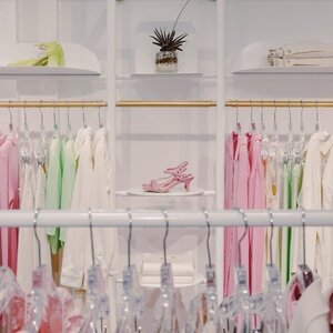
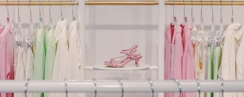
2700K: warm, atmospheric, premium
We often use 2700K when atmosphere and experience are the main priorities. The light feels homely and friendly and can give products a more premium appearance. Especially in boutiques, interior stores and concept stores, this is a strong choice, particularly in combination with well-placed accent lighting.
3000K: the retail classic
If we had to name one colour temperature that we recommend most often for stores, it would be 3000K. It is warm enough to feel comfortable, yet bright enough to present products clearly. It also works very well in shop windows, as it looks inviting without appearing yellowish.
4000K: fresh, functional, clean
4000K works well in environments where freshness, hygiene and visibility are important. Think of supermarkets, drugstores, work areas or stores with a modern, clean aesthetic. In showrooms and certain retail concepts, 4000K can also help to display products with sharp clarity.
5000K and above: niche use
This is mainly useful when a daylight-like evaluation is needed or in very specific situations. In most stores, this colour temperature feels too cold for a pleasant shopping experience.
CRI: the hidden factor that makes your products look better
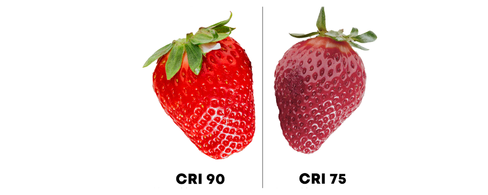
Kelvin determines the tone of the light, but CRI (Color Rendering Index) determines how naturally colours are reproduced. In retail, this often makes the difference between “properly lit” and “wow, this looks really good”.
In many stores, we recommend CRI > 90 for fashion, interiors, cosmetics and anything where colour accuracy is important. Even higher values, around CRI 95-98, are particularly relevant when colour precision is critical, such as in art galleries or high-end presentations.
Practical example: with a low CRI, a red shirt in the store may look slightly different than outdoors. That may seem minor, but it affects trust and can lead to more returns.
Product-specific lighting: why some stores benefit from tailored light sources
Not every store sells the same type of products, and therefore not every store needs the same light distribution or spectrum. In practice, we see that some product categories respond particularly well to lighting that is specifically adjusted to them.
Think of bakery products that look warmer and fresher under the right light, meat that appears richer in colour, or fish where a fresh impression is essential. In art and antiques, higher colour consistency can make a significant difference. In fashion, good CRI and consistency across fixtures are crucial for reliable colour presentation.
This does not mean that special light sources are always necessary. However, in stores where presentation directly impacts sales, it can be a clear advantage to consciously select product accent lighting.
Our approach: general lighting, accent lighting and window lighting
In retail, we almost always work with multiple layers of lighting, because a single type of lighting rarely meets all needs. General lighting ensures that the store is evenly and comfortably illuminated. Accent lighting, often using track spotlights, highlights products, displays and walls. Window lighting attracts attention from outside and shapes the first impression.
This combination creates a store that feels right: bright enough for comfortable shopping, yet with enough contrast and focus to make products stand out. For high-end retail, we often choose track lighting because of its flexibility. Spots can be repositioned when collections change, seasons shift or store layouts are updated, without the need for new drilling.
Common mistakes we see in stores
A store can be technically well-lit but still underperform due to choices that unintentionally work against its goals. In practice, we often encounter the following situations:
- One single colour temperature for everything, resulting in a lack of focus or atmosphere.
- Lighting that is too cool in a store that should feel warm and premium.
- Too low CRI, making colours appear less attractive or distorted.
- Too little accent lighting on walls and displays, making products look flat.
- A shop window without a proper lighting design, even though this is a major opportunity to attract visitors.
The good news is that this can usually be fixed without a complete renovation. A targeted adjustment of light colour, CRI or spotlight positioning can already make a big difference.
Need advice for your store or project?
The best light colour depends on your store type and desired look, the products you sell, ceiling height and layout, natural light and, of course, your budget. We regularly create lighting advice and lighting plans for stores and installers. We don't just look at brightness, but at how light supports presentation, customer flow and sales.
Would you like us to think along with you? Feel free to send a floor plan or a few photos of the space and briefly describe what you sell and what atmosphere you are aiming for. We can then quickly provide concrete recommendations.
